

The Beginning: Selecting Data
In searching for an appropriate and interesting data set for this project, we all agreed that finding data that teaches us something about Hong Kong is important, as we are all from other countries. We started independently searching sites like Open Data Hong Kong, data.gov.hk, and Hong Kong’s Census and Statistics site. While we found some interesting topics on these sites, they were a bit cumbersome to use and it was difficult to find a sizeable amount of extractable data on a topic that seemed interesting or that we could manipulate simply for the sake of learning the visualizations tools. In a scenario where we had more time or were looking for data that would answer a specific question, we undoubtedly could have found helpful data sets.
We decided to broaden our search to data from the UN. The UN is a credible organization that publishes data that much of the world uses — including academic researchers — as a reference. After poking around some categories we decided to pursue statics on world literacy rates. UN’s Statistical Data Base was a great starting point and helped guide us to their statistics on demographics. We looked at a few of the data sets in the category “statistics on men and women” and navigated to the “education” subcategory before ultimately selecting the literacy rates for males and females of both young adults (ages 15-24) and total adults (ages 15+).
None of us had prior experience with visualization tools beyond what is offered in Excel. So, once we decided on our data set, we each began to play with the data in both Fusion and Tableau Public. We came together to discuss our story ideas and learn from each other’s trials and errors, and we were each able to come up with the stories below.
What does it all mean?
Our group selected a data set that is international in scope, provides information over time and comes from a trustworthy source, the United Nations. We sought data that offered several points of comparison, because we hypothesized that a greater number of variables would reveal a larger number of potential stories.
Our data set provides the literacy rates for women and men across the world, based on country and according to two different timeframes. The United Nations defines literacy as “the ability to read and write, with understanding, a short, simple statement about one’s everyday life.” (The set does not include data for North America or Western Europe, however, because the methodology for collecting literacy statistics in these jurisdictions is not comparable, according to a background document.)
The data can be analysed by eye for quick-and-dirty conclusions, but deeper trends and avenues for exploration are revealed when it is crunched with digital tools. Our group uncovered several story possibilities, both macro and micro. We also determined there are further operations that could be performed on the data to create more tangible stories.
For example, a reporter could make a new spreadsheet that classifies the countries into distinct regions or continents. (Outliers, however, should still be taken into account.) This could be taken further so that regions are compared over time, looking at past and more current data. It could be useful to examine whether certain jurisdictions have improved, or, more interestingly, worsened. Then we would investigate why literacy went down. This would be a case of looking to the data after making an educated guess and seeing whether it supports the potential story. One example could be to look at countries that had good levels of education, or standards of living, that have recently been impacted by war. Might it be true that literacy was good in Syria but has recently plummeted?
Listed below are three stories we believe our data can be used to tell:
- Tamsyn – Global literacy by sex, averaged over time.
- Samantha – Guinea’s literacy rates falling faster for women than men.
Tamsyn – Global literacy by sex, averaged over time.
The chart illustrates how literacy rates stack up for men, women and both, as an average between two distinct data collection years, around the world. The colour-coded graph allows readers to easily distinguish and compare rates by eye. Hovering a mouse over any portion of the graph will provide an exact rate.
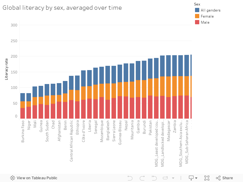
The data has further been sorted by literacy rates on the whole. This makes it simple to see which countries have the lowest and highest literacy. Scanning the names of countries with the lowest literacy reveals Burkina Faso, Niger, Mali, Guinea, South Sudan and Chad, before an outlier — Afghanistan. More African countries round out the low end of the list. Immediately, a conclusion can be drawn that the lowest literacy rates are in Central Africa, and that extends further through Africa. But additionally, that common ground is shared with at least one country in the Middle East. Seeing this depiction would allow for further investigation: Why is this particular region in Africa being affected the most, or the least developed? Are there similar factors in Africa and the Middle East that lead to low literacy rates?
It also becomes clear that men tend to be more literacy on the whole, however, the visualization reveals that the gap between men and women varies between countries. An example is Yemen, where the male literacy rate of 91 per cent is dramatically higher than the female rate of 58 per cent. Neighbouring Oman, by comparison, has an equal literacy rate of 98 per cent for both men and women. The finding would prompt us to pursue a story about the widest gaps and look for underlying causes.
Although this graph points us toward several possible stories, it also has flaws. In particular, we are concerned that averaging two sets of time-based data points may be apples to oranges. Countries in different regions of the world have faced wide historical variation, and such sociological factors likely have a greater impact on literacy rates than geographic factors. If every data set was collected in the same year, the comparison would be improved, but we still urge caution for any journalistic investigation to be very clear on what is being compared.
Samantha – Guinea’s literacy rates falling faster for women than men.
My journey with this data set seems like a long and sometimes rocky one. It was a love / hate / love affair. I was initially super excited to play in these tools and make an impressive visual that told a clear and compelling story. Then, I got frustrated and felt like I was drowning in a sea of data-related terms and functions. But then I finally found some footing was able to come up with this great little story about declining literacy rates in countries that are already below 50 percent literate.

First, I played around quite a bit with it in google Fusion and really enjoyed the mapping feature. It was amazing that I could so easily create an interactive map! However, when I tried to create other visualizations I quickly found myself up against a very hard brick wall. I didn’t understand a lot of what was happening to the data as I tried different settings and tried to clean the data in different ways.
So, I moved on to Tableau Public.
I immediately found the interface of Tableau Public to be much friendlier, but initially I had almost as hard of a time figuring out how to make something that would tell me something about the data. After several attempts at simplifying and cleaning up the data, I finally found traction by breaking down the data in Excel to show just the country, all gender (which required moving this specific data to a new worksheet), year, and literacy rates.
Once I imported this into Tableau Public, I was able to start making some progress. I played around with the category types until the data was formatted correctly and then started dragging and dropping. I was still having a hard time getting a visualization format that would show data over time — it seemed as though adding a third variable kept producing wonky looking visualizations.
Finally, I discovered filters. MAGIC.
I applied a filter for year just to cut down on what I was looking at. I started with the data from 2000 through 2014. There was still a lot to look at — too much. At that point, a question popped up in my head: “I wonder which countries have a literacy percentage below 50.” I applied another filter to limit the visualization to literacy rates between zero and 0.5 and found that eighteen countries qualified.
Bingo! My first lead.
At that point I was feeling much more positive about the direction of my story, but I was also terrified of mis-clicking and ruining all of my project. So I decided to simplify again, by cleaning up my data set again. I created another new worksheet that contained all of the data from just the eighteen countries with declining literacy rates, and this time I included data from men and women, in addition to just the combined average.
Now, feeling more confident, I created a new Tableau Public project and input my newly re-cleaned data. As a result, I was able to create the story here, which shows my process of looking at the initial eighteen countries with declining literacy rates, to a subgroup of countries with distinct data for rate for both men and women, to the observation that one of these countries, Guinea, had a noticeable difference between the declining rate of men versus women.
And that, my friends, is the story. To follow this story further, I would contact the UN and officials in country to learn about the causes of both the decline and the differences in rate decline between men and women. It would also be interesting to try and follow up on some of the other countries that showed declining data for one gender, or one gender and combined average.
To Sum it All Up
We believe a host of stories could be extrapolated from the visualizations of our data. But a word of caution, however, is warranted. Most statistics students learn never to mistake correlation for causation. This principle can be extrapolated further, and we would warn journalists against reading too quickly into their visualizations. Although a chart, graph or other visual representation might appear to say one thing, the same standards of verification used in journalistic work must be applied. If that’s not possible, the reporter should take care to express any limitations.